


What is a landing page? Definition, structure, examples
A landing page is a single page with exactly one goal: a conversion. What a landing page is, how it differs from a homepage and a website, what a good one consists of, and when it pays off.
Landing page, homepage, start page, website. These terms get thrown around constantly but do not mean the same thing. A landing page is something very specific: a page built for a single goal that leaves out everything else.
This article explains briefly and definitively what a landing page is, how it differs from a homepage and a website, what a good landing page consists of, when it pays off, and which mistakes kill the conversion.
Key takeaways
- A landing page is a single page with exactly one goal: a specific conversion, such as an inquiry, a purchase, or a sign-up.
- Users land there deliberately via an ad, a campaign, or a search result, not via the website main menu.
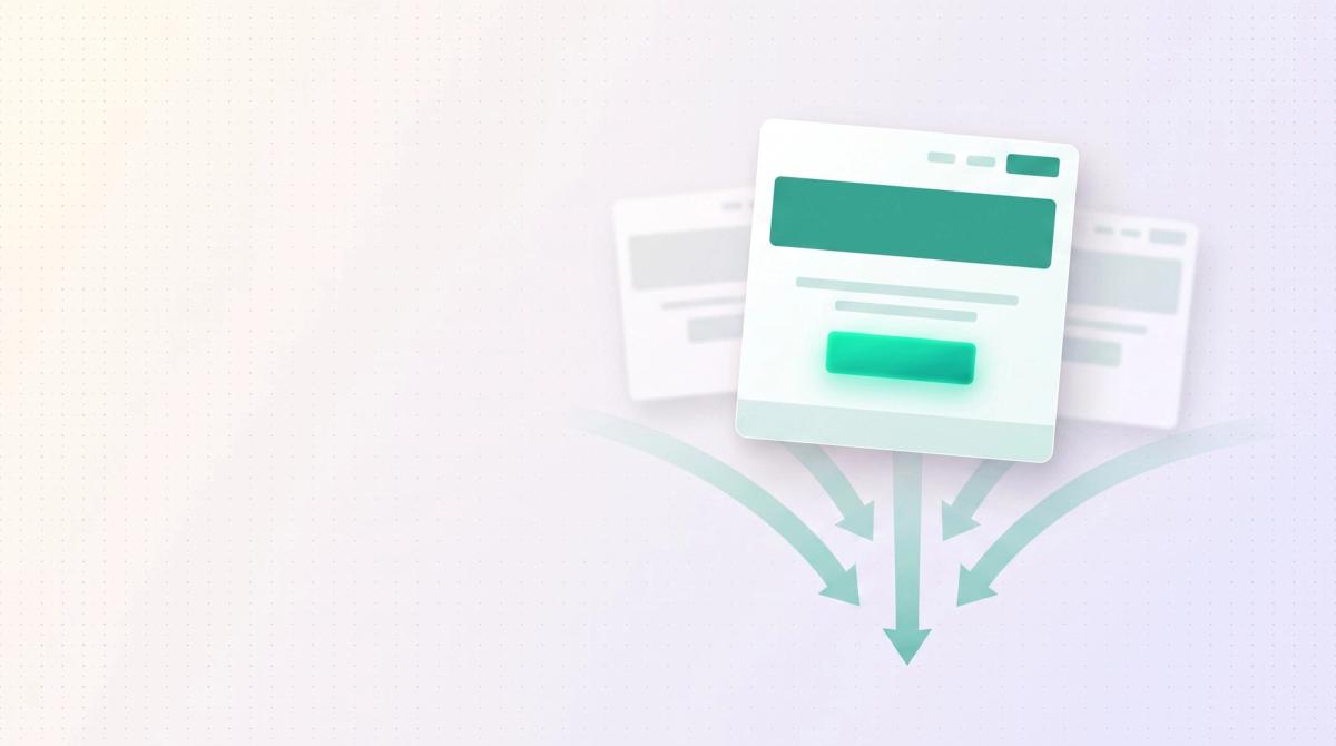
- The difference from the homepage: the homepage sends visitors in all directions, the landing page leads them in exactly one.
- A good landing page has a clear value proposition, social proof, a strong call-to-action, and no distracting menu.
- Landing pages pay off mainly for paid ads, product launches, and lead generation, where every click has a concrete goal.
What is a landing page?
A landing page is a single web page focused on exactly one goal: a conversion. Users land there deliberately, usually via an ad, an email campaign, a social media post, or an organic search result. The name comes from the fact that the visitor arrives here, that is, lands.
The decisive difference from any other page: a landing page has only one job. It wants to move the visitor to a single, predefined action. That can be a purchase, an inquiry, a newsletter sign-up, a download, or a booking. Everything on the page works toward this one goal. That is why a classic landing page often lacks even the navigation menu, so nothing distracts from the goal.
In short: a website informs broadly. A landing page converts with focus.
Landing page vs. homepage vs. website
These three terms get confused most often. The difference matters because it determines how you build the page. A website is the entire web presence, meaning all pages under one domain. The homepage is the start page of that website, the first page visitors reach via the main address. It shows the whole offering and distributes visitors further. The landing page is a single target page with just one focus.
Landing page, homepage, and website compared
| Criterion | Homepage | Landing page |
|---|---|---|
| Goal | Give an overview, distribute visitors | One concrete conversion |
| Number of goals | Many | Exactly one |
| Navigation | Full menu | Usually reduced or none |
| Traffic source | Direct visits, brand, organic | Ads, campaigns, targeted search |
| Content | Broad offering | One offer, one argument |
What a good landing page consists of
The exact structure depends on the goal and the offer, but good landing pages follow a clear pattern. These elements belong on almost every one:
Clear headline with a value proposition
The visitor has to understand in seconds what they get here and why. The headline names the concrete benefit, no filler.
One clear goal
The whole page works toward a single action. No second, competing offer that dilutes the focus.
Social proof
Testimonials, logos, reviews, or numbers. Trust comes from evidence, not from claims.
A strong call-to-action
A clearly visible button with a clear call to action. The CTA says exactly what happens next.
No distracting menu
Fewer exits mean more conversions. Anything that leads away from the goal should be removed when in doubt.
When a landing page pays off
Not every page needs a landing page, but in four situations it is clearly superior.
Paid ads. Whoever pays for clicks wants no scatter. An ad for one product belongs on a page that promotes exactly that product, not on the homepage. That way the ad and the target page match and the conversion rises.
Product or campaign launch. A new offer deserves its own stage, without distraction from the rest of the range.
Lead generation. When the goal is contact data, for example for a whitepaper or a demo, a focused page with one form reaches the goal far more reliably than a general page.
Targeted campaigns. Email, social media, or print with a QR code. Every campaign with a clear promise needs a target page that delivers exactly that promise.
Typical mistakes
Most weak landing pages fail at the same points. Whoever avoids these is already ahead of the majority.
Multiple goals. As soon as a page wants several things at once, the visitor decides on none. One goal per page, not three.
Too much text. Long explanations slow things down. A landing page shows the most important thing first and briefly, the rest below if needed.
Weak call-to-action. A hidden or vague button gives away conversions. The CTA has to stand out and clearly state what happens.
Slow load time. Every second of load time costs visitors, especially on the phone. A slow landing page loses users before they have read anything.
Distraction. Full menu, many links, competing offers. Anything that leads away from the one goal lowers the conversion.
What a landing page costs and who builds it
The cost depends heavily on scope, from a simple single-goal page to an elaborately designed campaign landing page with its own design, copy, and tracking. We go into detail in the article What a B2B website costs.
More important than the raw price is that the page is built for conversion and does not just look nice. If you want to have a landing page built that pays into a clear goal, or need professional web design in general, get in touch.
Frequently asked questions
The homepage is the start page of your entire website and distributes visitors into all areas of the offering. A landing page is a single page with only one goal and guides the visitor to a single action. The homepage opens doors, the landing page leads through exactly one.
Landing page literally means target page or arrival page. It refers to a page where a visitor lands after clicking an ad, a link, or a search result, and that is focused on exactly one action.
It depends heavily on scope, design, copy, and technology, from a simple page to a fully designed campaign landing page. We give a solid breakdown in our article on the cost of a B2B website. What matters is that the page is built for conversion.
One goal, one call-to-action. You can repeat the same CTA several times on the page so it is always within reach. But there should be only one action you want to prompt. Several competing CTAs dilute the focus and lower the conversion.
Usually yes. A campaign makes a concrete promise, and the target page should deliver exactly that promise. Whoever sends ads to the general homepage gives away conversions because the ad and the page do not match. A matching landing page per campaign gets significantly more out of it.
Usually not. A classic conversion landing page deliberately drops the full menu so the visitor does not click away. Fewer exits mean more conversions. For landing pages that should also rank organically, a reduced navigation can make sense.
More Articles


Let's talk about your project.
20-minute call, no sales pressure. You describe what you have in mind, we tell you if and how we can help.