


Optimizing a landing page: the checklist
Optimizing a landing page means one goal, one message, one strong call-to-action. The practical checklist for more B2B leads, plus how to test with A/B tests instead of guessing.
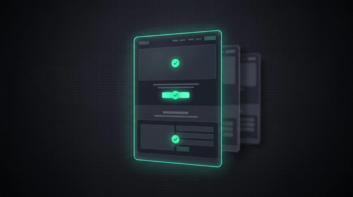
A landing page has exactly one job: to turn a visitor into a lead. Yet most pages leave conversions on the table because they try to do too much. Too many links, too many messages, forms that are too long, a CTA that drowns in the noise.
Optimizing a landing page is therefore less a design topic than a question of discipline. You remove everything that distracts from the goal and sharpen what leads to the click. This article gives you the practical checklist for it, with a clear B2B lead focus, and shows you how to prove your changes with A/B tests instead of guessing them.
Key takeaways
- A strong landing page follows one rule: one goal, one message, one call-to-action. Everything else distracts.
- The biggest conversion killers are not design details but too many options, forms that are too long, and missing social proof.
- The most important message and the first CTA belong above the fold, in the visible area without scrolling.
- Load time and mobile rendering decide conversions before the content is even read.
- Optimizing means testing, not guessing. One A/B test per hypothesis, measured against a clear conversion metric.
What makes a landing page strong?
A strong landing page makes a single decision easy. It picks the visitor up exactly where the ad or link promised, and leads them to the next step without a detour. The core is a rule that sounds simple and is rarely followed in practice: one goal, one message, one call-to-action.
One goal means the page pursues exactly one action. Book a demo or download a whitepaper or get in touch, not three of them at once. One message means the page promises a clear benefit and repeats it, instead of lining up five features. One call-to-action means there is one dominant button, and every other click option steps back behind it.
The difference from a normal website is exactly this. A homepage may offer many paths. A landing page may not, because every extra path costs conversion. What a landing page even is and how it differs from a website, we clarify in detail in the pillar article What is a landing page.
The optimization checklist
These eight points are the order in which we at INSYNC go through a landing page. Each point is its own lever. You do not have to implement all of them at once, but every ignored point costs you measurable conversion.
A single goal
Before anything else, define what a visitor should do. This one action is your conversion, and the whole page subordinates itself to it. If you have two equal goals, split them across two landing pages. A page that wants to sell a demo and fill a newsletter at the same time does both worse.
A clear hero message
The first screen decides. In the hero section, the visible area without scrolling, it must be clear within a few seconds: what is this, for whom, and what is in it for me. A concrete headline beats any clever wordplay. State the benefit, not the feature, and repeat the message from the ad the visitor came through. This message consistency is one of the strongest conversion levers there is.
Exactly one strong CTA
A call-to-action that dominates. It is visually the most striking point on the page, verbally concrete, and phrased in the visitor’s first person. Request a demo beats Submit. The same CTA may be repeated several times on the page, but it always stays the same in substance. Competing buttons with a different action weaken conversion, because every extra choice delays the decision.
Social proof visible right away
Trust comes from evidence, not from claims. Customer logos, real testimonials, concrete numbers, references, or awards belong visibly on the page, ideally close to the first CTA. In B2B, social proof from comparable companies matters most. A single credible customer quote with name and company works stronger than ten generic superlatives.
Distractions out
Everything that does not lead to the goal costs conversion. On a real landing page, the full navigation usually goes, along with superfluous links, footer menus with twenty entries, and anything that leads the visitor off the page. Every exit is a lost conversion. The page has one entrance and one way forward.
Short forms
Every extra form field lowers conversion. Ask only for what you truly need for the next step. In B2B, name, company, and email are often enough for a lead, you get the rest in the conversation. If you need more fields, stagger them in steps or explain why you need them. A form is not a questionnaire, it is the last hurdle before the conversion.
Load time under control
A page that loads too slowly loses visitors before they have read anything. Load time is therefore a direct conversion factor and part of the Core Web Vitals that Google evaluates. Optimize image sizes, reduce unnecessary scripts, and rely on server-side rendering. As a rough mark: under two seconds to visible content, and every additional second costs noticeable conversion.
Mobile first
Most traffic comes from smartphones, in B2B too. Your landing page therefore has to be thought mobile first, not as a shrunk version of the desktop page. The CTA must be reachable without zoom, the form usable with the thumb, the headline readable on the small display. What does not work in a few seconds on the phone does not work at all.
Test, do not guess
Optimization without measurement is opinion. Every change on your landing page is a hypothesis, and the only honest way to check it is the A/B test: you show two variants in parallel and measure which converts better. What matters is discipline. Test one thing per test, otherwise you will not know at the end what worked. Headline, CTA text, form length, or hero image are good first candidates because they have a big impact.
What you measure is the conversion rate, the share of visitors who complete your target action. Make sure enough visitors accumulate per variant before you declare a winner. A result from thirty visitors is chance, not evidence. And measure the action that counts, not clicks for the sake of clicking.
The systematic approach behind it, from hypothesis through test to roll-out, is its own field. How you turn it into an ongoing process, we show in the article Conversion optimization.
Frequently asked questions
Reduce the page to one goal, one message, and one strong call-to-action. Remove the navigation and all distracting links, make the hero message understandable in seconds, shorten the form to the essentials, and place social proof close to the CTA. Then you test the individual elements via A/B test.
The hero section decides the most, because it decides staying or bouncing in the first seconds. A clear headline with concrete benefit and an immediately visible, unambiguous call-to-action have the biggest lever. If it is not clear within a few seconds at the top what this is about, the rest of the page barely helps.
As few as possible. Every extra field lowers conversion. For a first lead, name, company, and business email are usually enough in B2B. Further information like budget or project scope is better gathered in the following conversation, not in the form.
A good A/B test changes exactly one element and measures the effect on the conversion rate. Good first candidates are the headline, the CTA text, the form length, or the hero image, because they have a big impact. What matters is running the test long enough until enough visitors have accumulated per variant.
Usually not. On a real conversion landing page, the full navigation distracts from the one goal and offers exits through which visitors bounce. For a pure campaign or lead page, you usually remove the navigation entirely. For pages that additionally need to provide trust and context, a reduced variant can make sense.
As fast as possible, as a rough mark under two seconds to visible content. Load time is a direct conversion factor and part of Google’s Core Web Vitals. Large images, unnecessary scripts, and missing server-side rendering are the most common brakes and can usually be fixed in a targeted way.
More Articles


Let's talk about your project.
20-minute call, no sales pressure. You describe what you have in mind, we tell you if and how we can help.