


Website animations: which ones build trust and which ones just annoy
Which website animations build trust and conversion, which ones drive visitors away, performance rules, accessibility, tools like GSAP, Lottie and Spline, costs and process.
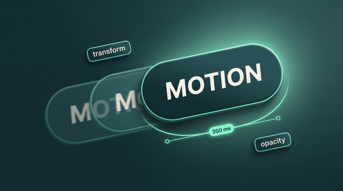
Website animations decide in the first two seconds whether a page feels premium or cheap. A headline that fades in calmly, a button that reacts on hover, a product that rotates as you scroll: these are signals the visitor does not read consciously but feels immediately. The same page with bouncing icons, parallax on every section and a preloader that eats three seconds looks like a template from 2016.
We have been building motion into B2B websites for years, from subtle micro-interactions to 3D hero scenes, and we learned one simple rule along the way: every animation needs a job. Either it explains something, it guides the eye, it gives feedback or it builds perceived value. If it does none of these four jobs, it gets cut. This article shows which animations on a website increase trust and conversion, which types exist, which performance and accessibility rules apply, which tools we use, what it costs and how working with a motion design agency runs.
Key takeaways
- Every animation needs a job: explain, guide, give feedback or build perceived value. Everything else is decoration and costs load time.
- Micro-interactions and a calm hero deliver the most, preloaders, auto-play carousels and parallax on every section annoy the most.
- Performance rule: animate only transform and opacity, lazy-load motion, keep LCP under 2.5 s and INP under 200 ms.
- prefers-reduced-motion is mandatory, not optional: ignoring the system setting loses visitors with vestibular disorders and violates WCAG.
- Stack 2026: GSAP for scroll and timelines, Framer Motion in React, Lottie or Rive for vector, Spline or Three.js for 3D, video only with an FFmpeg pipeline.
Which website animations increase trust and conversion?
Website animations increase trust and conversion when they fulfil one of four tasks: they explain a product that cannot be explained in still images, they guide the eye to the next step, they give feedback on an action, or they build perceived value because the page feels the way the company positions itself. A manufacturer of precision machinery whose website stutters loses exactly the argument it sells.
The pattern behind it is old. Since the 1990s the Nielsen Norman Group has described three perception limits: under 0.1 seconds a response feels instant, up to 1 second the flow of thought stays intact, from 10 seconds attention is gone. Good animations live in the first zone. A button that reacts on hover within 150 milliseconds says "this site works". A form that does nothing for 800 milliseconds after submitting says the opposite.
That is why the unobtrusive animations deliver the most: hover states on cards and buttons, a form field that validates while typing, a menu that opens in 200 milliseconds. Then the hero: when headline, subline and button fade in as a clean sequence, the visitor understands the order in which to read. That is not decoration, that is reading guidance. Why calm on a page creates trust is in the article Why minimalism builds trust, and animation is the extension of that principle into time.
Which animations annoy visitors and cost conversion?
Animations cost conversion as soon as they make the visitor wait, distract them or take away control. The classics: a preloader with a percentage that hides for three seconds what the page would have loaded anyway. A hero video with autoplay and 12 MB that ruins the data plan and the LCP on mobile at the same time. A carousel that jumps every four seconds while the visitor is still reading. Parallax on every single section so the content lags behind the viewport while scrolling.
Then there is "too much of a good thing": scroll reveal on every paragraph means the visitor has to wait for every paragraph. Whoever scrolls fast because they are looking for something specific sees an empty page. And scroll hijacking, overriding native scroll behaviour, is the most reliable way to make visitors angry: they scroll, and the page does something else.
The rule we derived from this: an animation must never take longer than the action it accompanies. A click needs 100 to 200 milliseconds of feedback, a page transition 300 to 500, a hero intro one second at most. Anything beyond that is a film the visitor did not order.
What types of website animations exist?
Website animations can be divided into six types, and each has a different effort, a different weight and a different job. Micro-interactions are the smallest: hover, focus, toggle, loading state. They are almost free, run in CSS and make the biggest difference in how a page feels. Scroll reveal fades in content when it enters the viewport and works with the Intersection Observer or GSAP ScrollTrigger. Used properly, meaning sparingly and fast, it gives the page rhythm.
Hero motion is the stage: a sequence on load, a product that moves, a background with depth. This is where the first impression is decided, and this is where the effort pays off. 3D scenes with Spline or Three.js go one step further and let the visitor rotate a product or scroll through a scene. What that delivers, where the limits are and what it costs is in our article on the 3D website. Lottie and Rive are the vector class: animations from After Effects or directly from Rive, as JSON or binary file, scalable, small, ideal for icons, illustrations and explanatory diagrams.
The sixth type is video. A short loop in the hero or a product film in the feature section. Video is the heaviest type and the one where most mistakes happen: wrong format, no poster image, no lazy load, 30 seconds instead of 6. How to embed videos without slowing down the whole page is explained in the article Optimizing videos for the web. The Apple-style scrollytelling where a product rotates frame by frame as you scroll is, by the way, not a separate type but an image sequence controlled by scroll position. How that works technically is shown in our tutorial on the Apple scroll effect.
Animation types compared
| Type | Job | Weight | Tool |
|---|---|---|---|
| Micro-interactions | Feedback, usability | Almost zero (CSS) | CSS, Framer Motion |
| Scroll reveal | Rhythm, reading guidance | Low | Intersection Observer, GSAP ScrollTrigger |
| Hero motion | First impression, perceived value | Medium | GSAP, Framer Motion |
| Lottie / Rive (vector) | Icons, illustration, explanation | Low to medium | Lottie, Rive |
| 3D scene | Show product, differentiation | High | Spline, Three.js |
| Video | Product in action, emotion | Very high without optimization | FFmpeg, WebM/MP4, poster |
Which performance rules apply to animations on the website?
The most important performance rule for website animations: animate only transform and opacity. The browser processes these two properties on the GPU without recalculating the layout. Whoever animates width, height, top, left or margin instead forces the browser into layout and paint on every frame, and exactly that creates the stutter visitors perceive as a "slow site". A will-change on the animated element helps, but only targeted, not on 200 elements at once.
Second rule: motion must not slow down the initial load. The Core Web Vitals are the benchmark here. The LCP, the moment the largest visible element is rendered, must be under 2.5 seconds. A hero intro that only fades in the headline after a 1.5 second delay pushes the LCP back. The INP, the response time to input, must stay under 200 milliseconds. A scroll handler that touches the DOM on every pixel blows that. The CLS, the jumping of layout, must stay under 0.1. Animations that claim space they did not have before are CLS cause number one. How to measure and fix the three values is in the article on Core Web Vitals.
Third rule: lazy load for everything not in the first viewport, and load libraries only where they are needed. GSAP with ScrollTrigger is around 70 KB, Three.js over 600 KB. Fourth rule, from experience: test on a real mid-range Android, not just in the DevTools throttle. In "Milliseconds Make Millions", Google and Deloitte showed that 0.1 seconds faster load time can bring up to 8 % more conversions. An animation that costs 0.3 seconds therefore has to be very good.
Accessibility: what does prefers-reduced-motion mean for website animations?
prefers-reduced-motion is a system setting with which users in macOS, iOS, Windows and Android request less motion, and every website must respect it. People with vestibular disorders get dizziness and nausea from parallax and large-scale movement, people with ADHD are distracted by constant motion, people with photosensitivity react to flicker. That is not a fringe group, and since the German accessibility act (BFSG) it is also a legal question for many companies.
Technically it is simple: a CSS media query in which animations are reduced to a short opacity fade. GSAP has gsap.matchMedia, Framer Motion has the useReducedMotion hook, Lottie and Rive can be paused via JavaScript. The point is not to switch everything off. A hover state stays, a fade stays. What goes is everything that moves, scrolls or loops on a large scale: parallax, autoplay video, background animations.
On top of that come three WCAG rules that apply regardless of the system setting: anything that runs automatically for longer than five seconds needs a pause option. Nothing may flash more than three times per second. And content must not be understandable only through motion, so a diagram that builds up on scroll needs a static alternative.
Which tools and which stack are suitable for motion on the website?
For motion on the website, five tools have established themselves in 2026, and the choice depends on what is animated and in which stack the site runs. GSAP is the standard for everything to do with scroll and timelines: ScrollTrigger, pinning, chained sequences, SVG morphing. Since the acquisition by Webflow in 2025, GSAP including all plugins is free, which settled the former licensing argument against GSAP. Framer Motion, now called Motion, is the first choice in React and Next.js projects for component animations, layout transitions and gestures, because it lives declaratively in the code and works with the component model.
Lottie remains the tool when animations are created in After Effects and should go on the page as vectors. Rive goes further: its own editor environment, state machines, interactive animations that react to hover or scroll, with smaller files than Lottie. We built a dedicated department for it, more in the press piece on vector-based animation flows. Spline is the fastest way to a 3D scene without Three.js code, at the price that the runtime is heavy and the scene often has to be reduced on mobile.
For video we have an FFmpeg pipeline: source file in, WebM and MP4 in two resolutions out, poster frame automatically, sound removed if it is a loop. The difference between a 40 MB export from Premiere and a 1.8 MB loop is the difference between 5 and 1.5 seconds LCP. The stack underneath is Next.js or Astro with Sanity for us, Webflow as an option. As a motion design agency we decide the tool per element, not per project: micro-interactions in CSS, scroll in GSAP, illustrations in Rive, product in Spline or video.
What do website animations cost?
Website animations cost anywhere between almost nothing and a five-figure amount depending on type, and the honest answer depends on whether motion is part of a website project or commissioned separately. In the market, motion design hourly rates in the DACH region sit at 60 to 150 € according to 2026 industry overviews, a logo animation starts at around 500 €, a 60-second explainer video with concept and voice-over at 3,000 to 8,000 €. Those are market values for orientation, not INSYNC prices.
With us, micro-interactions, scroll reveal and an animated hero are part of every website project: one-pager 6,000 to 8,000 €, business website 8,000 to 15,000 €, premium website 15,000 to 30,000 € and up. The difference between the tiers lies among other things in how much individual motion is included: in the one-pager it is clean hover states and a hero intro, in the premium project Rive illustrations, 3D scenes or scrollytelling are added. Individual motion packages for existing sites, such as a new hero with a 3D product or a set of Rive icons, we quote per project by scope. What drives the price is not the animation duration but the number of individual assets and their states: a Rive icon with three states costs more than a Lottie loop, a 3D scene that reacts to scroll and works on mobile more than a rendered video.
The most common mistakes with website animations
The mistakes with website animations are almost always the same, and most happen because motion is put on top as decoration at the end of the project instead of being considered at the start. First: animation without a job, an icon that wobbles because it can. Second: everything at once, so there is no order and therefore no reading guidance. Third: too slow, easing curves with 1.2 seconds duration look elegant in the prototype and like a brake live. Fourth: layout properties animated, the classic is an accordion that animates height. Fifth: no fallback for the Spline scene that does not load on the iPhone SE. Sixth: prefers-reduced-motion ignored. Seventh: motion that does not fit the brand, a tax advisor does not need a particle explosion.
The most expensive mistake is a different one though: motion as a substitute for clarity. We have seen sites where every element was animated and after scrolling nobody could still say what the company offers. Animation amplifies a message. If there is none, it amplifies nothing.
How does working with a motion design agency run?
Working with a motion design agency does not start with animations but with the question which parts of the page need motion and why. With us that is a motion briefing per page: which three moments are closest to the business goal, and what should the visitor feel or understand there. Then comes a motion concept as a short video or prototype, then production, integration, performance check and reduced-motion variant. The steps below show the process as it runs at a motion design agency with its own development team. The difference to a pure animation studio is the last part: a studio delivers files, an agency with developers delivers a page that stays fast with the files.
Motion briefing
Define three moments per page that need motion, and per moment the job: explain, guide, feedback, perceived value. Everything else stays static.
Concept and prototype
Short motion concept as video or prototype in Figma or Rive: timing, easing, order. Approval before assets are produced.
Asset production
Rive or Lottie files, Spline scene, image sequence or video via the FFmpeg pipeline. Every asset with a size budget and fallback.
Integration and performance check
GSAP or Framer Motion in the stack, lazy load, only transform and opacity, test on real devices, Core Web Vitals in the green.
Reduced motion and approval
prefers-reduced-motion variant, pause option for anything over five seconds, static alternative for diagrams, then go-live.
Frequently asked questions
Animations are neutral for SEO as long as they do not worsen the Core Web Vitals and do not hide content. It gets critical when motion pushes the LCP above 2.5 seconds, when text only appears in the DOM after scroll reveal or when a preloader hides the content. Fast, GPU-based animations with lazy loading have no negative effect on rankings.
A B2B website needs clean micro-interactions on buttons, cards and forms, a calm hero intro with a clear order and sparing scroll reveal for sections. Plus, if the product allows, an explanatory animation for the core process or a 3D view of the product. You can do without preloaders, autoplay carousels, parallax on every section and scroll hijacking.
A website animation should never last longer than the action it accompanies: 100 to 200 milliseconds for hover and click feedback, 200 to 300 for menus and toggles, 300 to 500 for page transitions and scroll reveal, one second at most for a hero intro. Anything beyond that makes the visitor wait and, for hero elements, pushes the LCP back.
GSAP is better for scroll animations, timelines, pinning and SVG, and completely free since 2025. Framer Motion, now Motion, is better for component animations, layout transitions and gestures in React and Next.js because it lives declaratively in the code. In many projects we use both: Framer Motion for UI states, GSAP for everything tied to scroll.
Lottie plays animations created in After Effects and exported as JSON. Rive has its own editor and state machines with which animations react to hover, click or scroll, usually with smaller files. For pure loops and icons Lottie is enough, for interactive illustrations and characters with several states Rive is the better tool.
Yes. Website animations must respect prefers-reduced-motion, anything over five seconds of autoplay needs a pause option, nothing may flash more than three times per second, and content must not be understandable only through motion. Since the German accessibility act (BFSG) this applies legally to many companies in Germany, not just as best practice.
Motion design agency
Animations with a job: micro-interactions, scroll, Rive, 3D and video, integrated by a team with its own developers.
3D website
When a 3D scene pays off, what Spline and Three.js deliver and what it costs.
Core Web Vitals
Understand, measure and fix LCP, INP and CLS so motion does not slow down the page.
The Astro framework explained
What Astro is, how islands work and when it fits.